Designing Swedbank's first digital savings advisory experience
Swedbank needed to bring legally compliant financial advisory into digital channels to scale advisory services and meet changing customer expectations. I led UX design for the first advisory MVPs, solving a critical 95% drop-off on the first screen while navigating regulatory requirements, design system constraints, and cross-functional stakeholder alignment.
Challenge
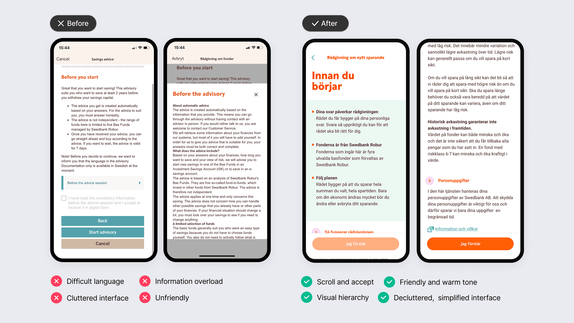
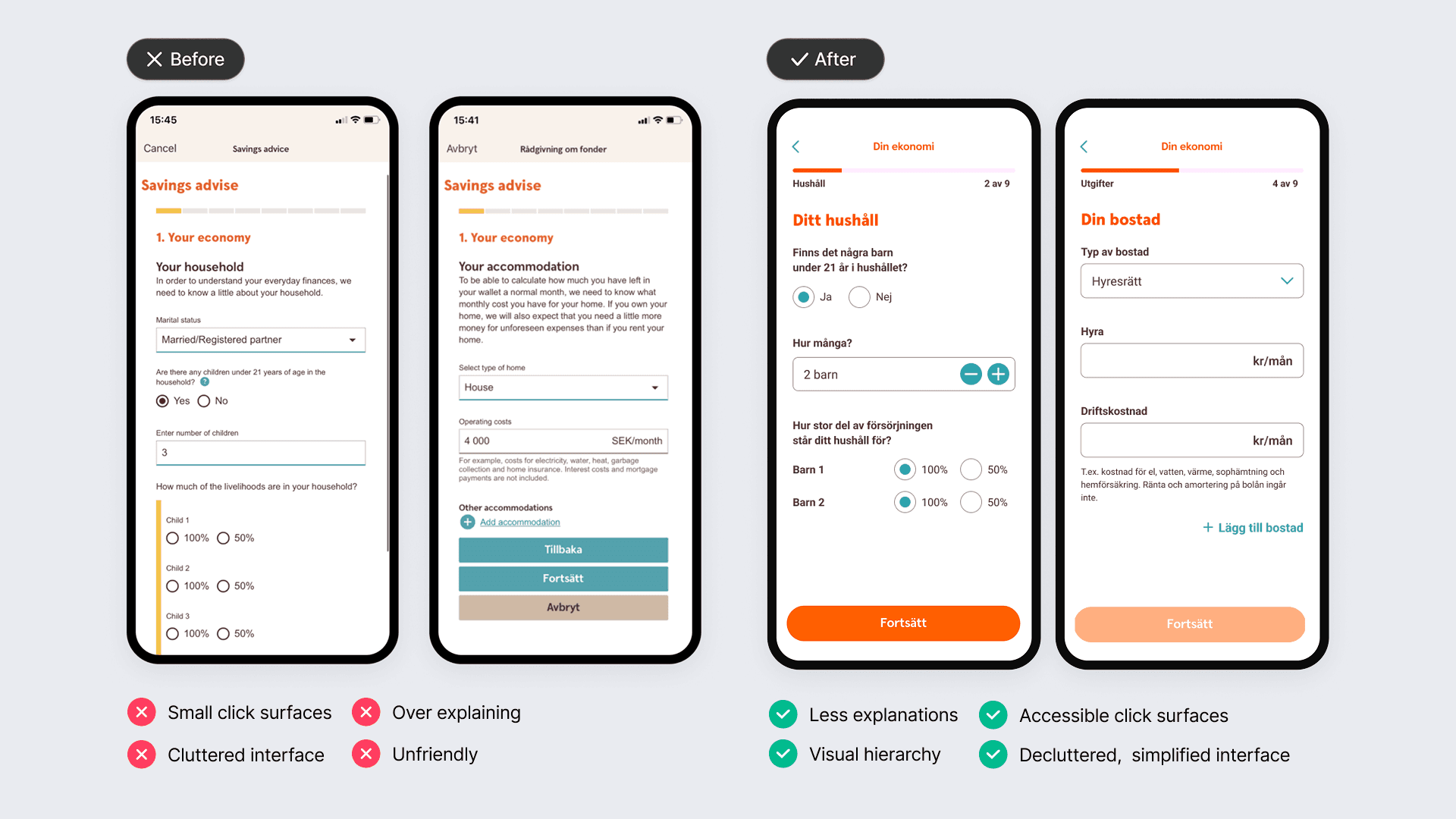
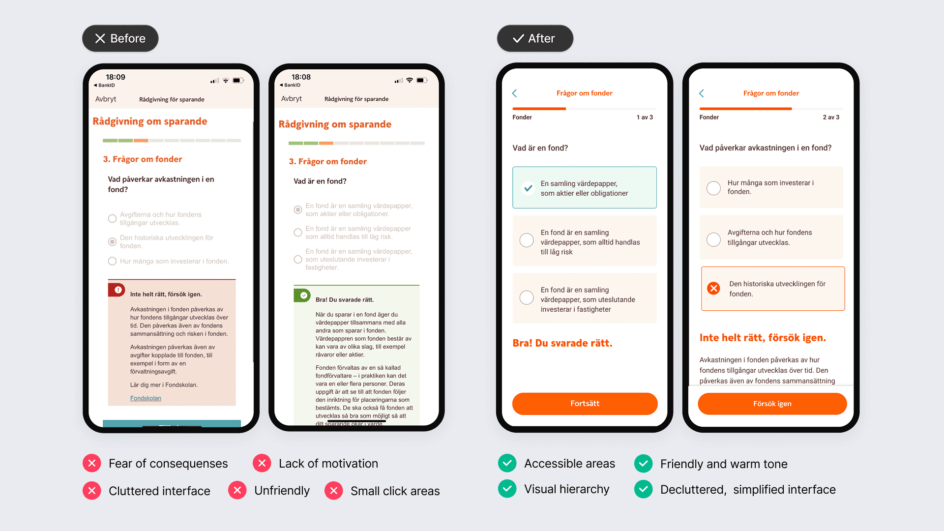
Swedbank wanted to offer customer-centric, legally compliant financial advisory in digital channels, but advisory had traditionally been handled offline. Early MVPs revealed a critical challenge: a ~95% drop-off on the very first screen of the advisory flow. Users struggled to understand the purpose, value, and effort required before even starting the advisory. Strict legal requirements and an existing design system limited how much the experience could be simplified, while still demanding high trust and cognitive effort upfront.
Swedbank wanted to offer customer-centric, legally compliant financial advisory in digital channels, but advisory had traditionally been handled offline. Early MVPs revealed a critical challenge: a ~95% drop-off on the very first screen of the advisory flow. Users struggled to understand the purpose, value, and effort required before even starting the advisory. Strict legal requirements and an existing design system limited how much the experience could be simplified, while still demanding high trust and cognitive effort upfront.


Approach
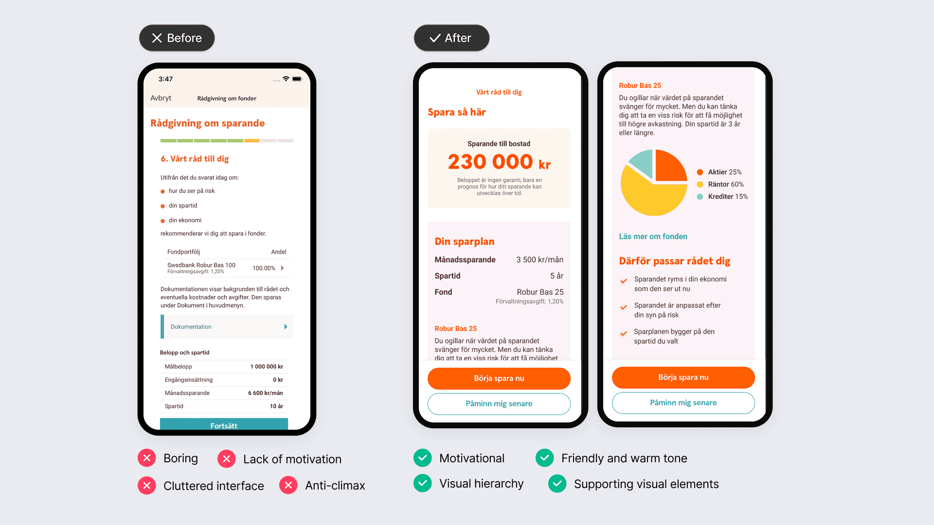
I approached the challenge by focusing on how the advisory was introduced and explained to users, rather than only optimizing individual steps. Early research showed that users dropped off before understanding the purpose, value, or effort required to complete the flow. I first worked within existing regulatory and design system constraints, using analytics, interviews, and usability testing to make incremental improvements. When these changes reached their limits, I initiated a collaboration with UX, UX copy, legal, and the design system team to explore a new design concept. The concept focused on clearer framing, reduced cognitive load, and a more human, approachable tone - while remaining compliant.
I approached the challenge by focusing on how the advisory was introduced and explained to users, rather than only optimizing individual steps. Early research showed that users dropped off before understanding the purpose, value, or effort required to complete the flow. I first worked within existing regulatory and design system constraints, using analytics, interviews, and usability testing to make incremental improvements. When these changes reached their limits, I initiated a collaboration with UX, UX copy, legal, and the design system team to explore a new design concept. The concept focused on clearer framing, reduced cognitive load, and a more human, approachable tone - while remaining compliant.
Key tentions
• Legal correctness vs. approachability • Design system consistency vs. meaningful UX change • Incremental improvements vs. conceptual reframing
• Legal correctness vs. approachability • Design system consistency vs. meaningful UX change • Incremental improvements vs. conceptual reframing
Design focus
• Clarify purpose and expectations early • Respect constraints without being constrained by them • Design for user stamina, not just completion
• Clarify purpose and expectations early • Respect constraints without being constrained by them • Design for user stamina, not just completion
I approached the challenge by focusing on how the advisory was introduced and explained to users, rather than only optimizing individual steps. Early research showed that users dropped off before understanding the purpose, value, or effort required to complete the flow. I first worked within existing regulatory and design system constraints, using analytics, interviews, and usability testing to make incremental improvements. When these changes reached their limits, I initiated a collaboration with UX, UX copy, legal, and the design system team to explore a new design concept. The concept focused on clearer framing, reduced cognitive load, and a more human, approachable tone - while remaining compliant.
Approach
Result
Usability testing of the conceptual design showed a major improvement: 9 out of 10 users were able to pass the first screen, compared to near-total drop-off in earlier versions. The concept demonstrated how compliant advisory could be both understandable and inviting, and was presented to key stakeholders as a foundation for future digital advisory work.
Usability testing of the conceptual design showed a major improvement: 9 out of 10 users were able to pass the first screen, compared to near-total drop-off in earlier versions. The concept demonstrated how compliant advisory could be both understandable and inviting, and was presented to key stakeholders as a foundation for future digital advisory work.

Usability testing of the conceptual design showed a major improvement: 9 out of 10 users were able to pass the first screen, compared to near-total drop-off in earlier versions. The concept demonstrated how compliant advisory could be both understandable and inviting, and was presented to key stakeholders as a foundation for future digital advisory work.
Result
More projects

Redesigning and relaunching Fondo’s API Docs
Led a product-led redesign to improve UX, DX and onboarding

Designing embedded investment flows for fintech platforms
Product design for scalable, compliant partner integrations

Aligning Fondo’s public presence with its B2B strategy
Product-led repositioning across web, search, and brand

More projects
Redesigning and relaunching Fondo’s API Docs
Led a product-led redesign to improve UX, DX and onboarding
Redesigning and relaunching Fondo’s API Docs
Led a product-led redesign to improve UX, DX and onboarding
Designing embedded investment flows for fintech platforms
Product design for scalable, compliant partner integrations
Designing embedded investment flows for fintech platforms
Product design for scalable, compliant partner integrations
Aligning Fondo’s public presence with its B2B strategy
Product-led repositioning across web, search, and brand
Aligning Fondo’s public presence with its B2B strategy
Product-led repositioning across web, search, and brand